
Hatch can reprint its greatest hits using the same elements
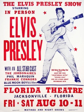
You may not know the name Hatch Show Print, but you know the style. Its block letters are visually synonymous with Nashville and country music history. When Hatch began business in 1879, Nashville was the fifth-largest printing center in the United States, and at that time, hand-assembled letterpress was how printing was done.
The middle years of the 20th century were hard on letterpress. Newer technologies rose to supplant the inky, time-consuming moveable type method, and both machines and their output were trashed. But Hatch’s curator and chief designer, Jim Sherraden, saw beauty in its imprecision, and he rebuilt the faltering business into an indispensable institution.
To someone in the 1880s, the blocky letterpress style that filled every handbill and advertisement simply signified disposable culture. Today, with so few practitioners, Nashville virtually owns the look.
I was lucky enough to be invited behind the scenes of Hatch Show Print.
The video shows you just how damn cool it is:
This graphic design stalwart merits its own book: Hatch Show Print: The History of a Great American Poster Shop. I want one.

Letter by letter, page by page, we leave history behind